Color Accessibility
Web accessibility empowers individuals with disabilities to fully engage with and contribute to the applications you develop. This crucial principle encompasses various aspects, including the intentional utilization of colors. Your color system should adhere to the principles of being perceivable, operable, understandable, and robust for all users.
Color Contrast Ratios
Color contrast compliance is required within our experience. The contrast ratio is the difference between colors that live on top of one another or next to one another, also known as adjacent colors. If the design elements within any design pattern contain information critical to understanding the interaction, it must pass color contrast.
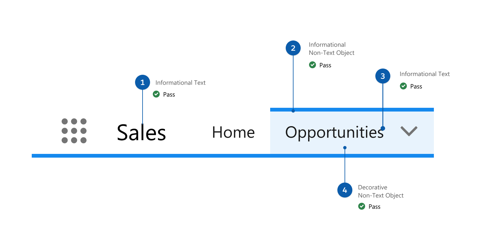
All four objects in this example pass color contrast, including the default informational text (1), the informational non-text (2), the selected informational text (3), and the decorative non-text (4) objects.
Ensuring colors meet WCAG color contrast rules can be a tricky, manual process. Our system provides clear and obvious guidance on which colors work together, and which ones don’t. Built-in contrast ratio scores solve for those decisions.
When designing any element of the UI there are questions we need to always be asking ourselves. Do you know what the difference between decorative and functional UI is? Is the UI element or elements of a design pattern decorative or functional? The answer to these questions determines the color contrast requirements of the UI element or elements being created.
In this example, the badge provides necessary information for the user to understand in order to advance within an experience. These qualities make it functional. However, the UI elements that compose a badge may be functional (the text) or decorative (such as the shape or background.) This image shows a decorative background (1), a decorative badge (2), and functional text (3).
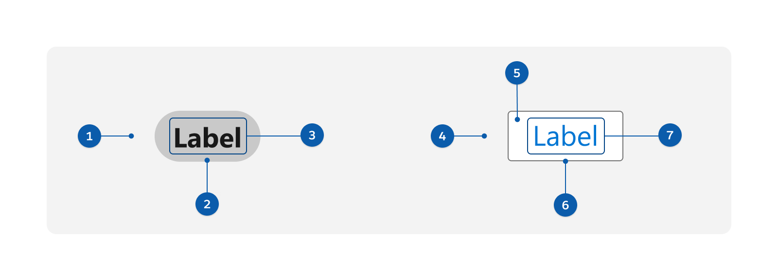
For the neutral button in this example, the image shows a decorative background (4), a functional background within the visible container (5), a functional visible boundary (6), and functional text (7). Note that decisions can be more nuanced and should be informed by our color contrast guidelines. (Review the Color Contrast Rules in the section below.)
Knowing whether a UI element is decorative or functional is crucial for meeting color contrast guidelines. Test your ability to design with accessibility compliance in mind by taking this How to Design with Color Contrast quiz.
Color Contrast Rules: UI Design Cheat Sheet
- If it serves a function, make it contrast-compliant.
- Text always requires contrast.
- To convey meaning, don’t solely rely on color.
- Intended visibility must pass contrast.
- Use secondary indicators.
Color contrast applies to text, state indicators, purpose indicators, and anything else that can be interpreted as crucial to understanding an interaction.
Text contrast requires 4.5:1, unless it’s large, and everything else is 3:1.
Avoid using color as the sole indicator of state in a component. Color should never be a primary indicator for something that is functional.
When a functional UI is visible at all, it should be visible for all, unless it’s purely decorative.
When trying to avoid relying on color for communication, height or width changes, icons, and secondary text-based indicators are your friend.
The Numerical System
In our numerical color system, it’s simple to remember the “magic numbers”:
What must be a 50 point difference?
What must be a 40 point difference?
Decorative vs. Functional Elements
We declare elements in our experience as either decorative or functional. Decorative elements aren’t required to pass color contrast accessibility requirements while functional items do.
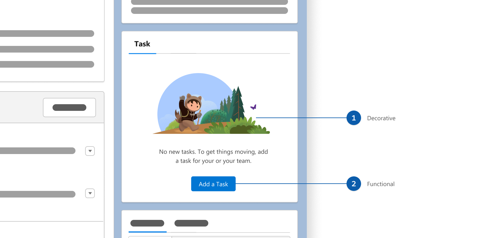
In this example, the decorative image (1) is an illustration being used for brand expression. It doesn’t include information or functionality that would disrupt a user from taking action. Because of that it isn’t required to pass color contrast. However, the functional button text and background (2) are required to be color contrast compliant. This is because they can be interacted with and convey important information.
Keep in mind, however, that just because something doesn't "need" to pass color contrast doesn't mean it shouldn't. There are always opportunities to make a UI more accessible, even if there aren't rules that say it's needed. Just because there's a bare minimum doesn't mean we should strive for that. Designing accessibly serves all users better.
Redundant vs. Informational
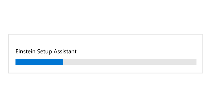
What is the difference between when something is redundant and something is informational? A visual element becomes redundant when paired with a functional element.
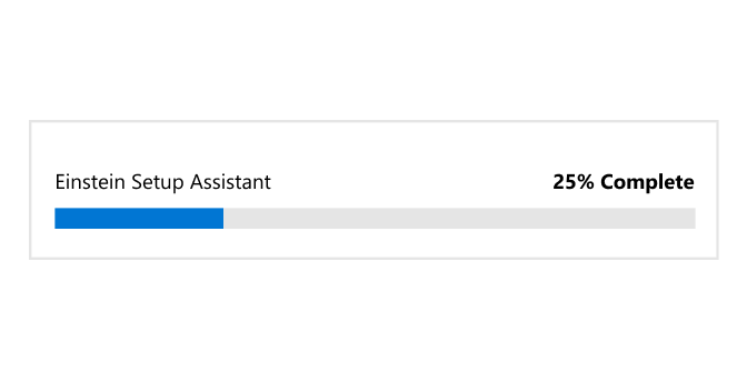
In this example, the displayed descriptive text for percentage on the progress bar makes the graphic of progress (in blue and gray) redundant.
Having contextual awareness is important. Just because something is considered redundant here, doesn’t mean it may not be used elsewhere as an informational or functional element.
Contextual Awareness
An element may be compliant in one part of an experience but that doesn’t automatically mean that it’s compliant elsewhere. Understanding this principle is key to practicing contextual awareness while designing.
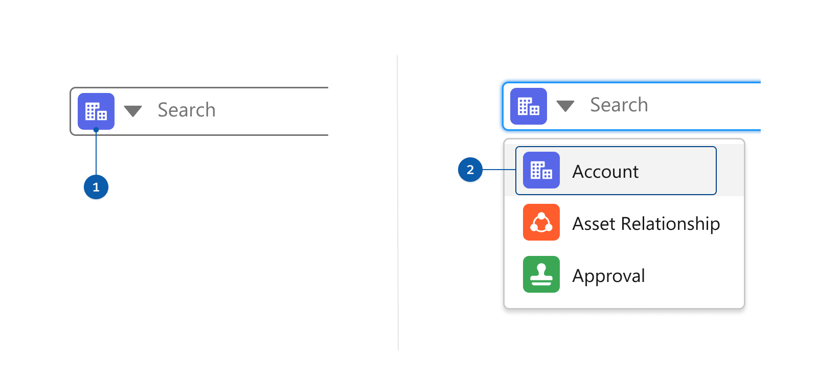
In this example, because the first icon (1) isn’t paired with descriptive text it’s required to be 3:1 contrast ratio or greater. However, because the second icon (2) is paired with descriptive text, technically speaking, it isn’t required to pass 3:1. In our system, to alleviate deltas, all of our icons meet a 3:1 contrast ratio or greater.
When Color is the Only Option
Color contrast guidelines for state changes and other status communication are often hard to meet for complex interactions because of the number of colors that must contrast with each other.
This requirement only applies when color is the only means of conveying information. Common ways to avoid this requirement by providing a secondary information source are:
These examples show that a state icon can act as a secondary information source that reduces sole reliance on color.
Reverse Text on Relevant Backgrounds
Although we commonly use white text on backgrounds, sometimes background colors are too light for white text or objects. In those cases, consider using dark text for added emphasis and to meet compliance.
To read more about text on backgrounds, visit General Guidelines for Text on Backgrounds.
Borders and Backgrounds Visibility
If there’s a perceivable target boundary or click target, it must pass 3:1+ contrast ratio. This rule applies to gray borders and backgrounds. The w3C recommends making the target area visible to assist users with cognitive disabilities, and their recommendation is our rule.
We saw the recommendation as an opportunity to evaluate our own patterns. In that investigation we recognized value in creating a rule for all interactive visual boundaries to meet a 3:1 or greater color contrast.
In this example, the border in the first button’s target boundary uses neutral-60 and passes at 3:1. The second button doesn’t pass color contrast.


Resources
- Creating Color Contrast Guidelines to Meet WCAG 2.1 and Beyond
- Do You Know How to Design with Color Contrast? Quiz Yourself to Find Out
- Are My Colours Accessible
- Introducing the Salesforce Color System
- The A11Y Project
- Web Accessibility Initiative: Making the Web Accessible
- Web Accessibility in Mind
- Salesforce Design Accessibility Topics
- Salesforce Disability Topics