New Global Styling Hooks Guidance
This document describes the new Salesforce Lightning Design System (SLDS) global styling hooks and calls out best practices for using them. Use this document to help you implement the changes recommended in Prepare Customizations for SLDS Architecture Updates. See the SLDS Architecture Updates FAQs for more information.
Note: The existing Styling Hooks section describes component styling hooks that you use to style at the component level. The new styling hooks have a wider scope which makes them more versatile.
Global Styling Hooks
Use the global styling hooks to apply Salesforce Lightning Design System values correctly to style your components. The design system determines the values of global styling hooks. Salesforce can change these values at any time and announce the changes in release notes. We don’t support overriding the values of global styling hooks in your customizations.
What are Global Styling Hooks?
Global styling hooks are CSS custom properties that we identify with the '-g-' syntax that comes after the --slds- namespace in the custom property name. They're designed for general use and don't impose specific usage rules. You can apply these properties across standard HTML elements, components, selectors, and more. The versatility of global styling hooks allows designers to implement overarching changes to an application, while complying with the Salesforce Lightning Design System.
We created a system to define the values and names of the styling hooks. The styling hooks typically are in sets, where each hook has a common base name and ends with a different numerical identifier. Generally, the set begins with '1', signifying the smallest or starting value, and increments by 'x'. However, each category can have different ranges within its set, reflecting their usage frequency in UI design. For instance, font sizes likely have a wider range than box-shadows.
Global styling hooks are organized into several property categories, each addressing a different aspect of design:
- Colors: These properties define the color palette of your application and include primary key colors, UI surface colors, neutral colors, and explicit colors.
- Font: These properties influence the typography in your application, defining aspects like font family, size, weight, line-height, etc.
- Border radius: These properties manage the curvature of UI elements' corners, impacting the perceived softness or hardness of components.
- Shadows: These properties control the appearance of shadows, affecting the depth perception and layering of UI elements.
- Sizing: These properties dictate the dimensions of UI components, directly affecting layout.
- Spacing: These properties govern the amount of space between UI elements, guiding the overall layout and ensuring adequate whitespace for readability and aesthetics.
In summary, global styling hooks offer a structured, flexible, and wide-ranging framework for designers to effectively craft their application's look and feel. The SLDS color system is part of these properties and plays a crucial role in defining the visual identity of your application.
Do not reassign globals
Re-assigning a new value to a global styling hook inside your component is prohibited. You will be subject to test failures and future breaking changes. Global styling hooks are only for consuming a predetermined value defined by the Design System. The values are subject to change by Salesforce.
General Concepts
Here are some helpful concepts to hold onto as you read further.
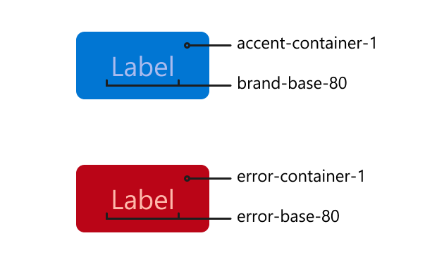
- Semantic UI Colors: A set of semantic styling hooks that derive the design properties that express the visual language of the SLDS brand. These styling hooks are mutable and their values are subject to change.
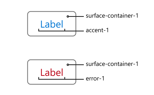
- Surface: Used for backgrounds and large areas of the application that express new visual stacking context to create visual depth.
- Accent: Accent colors, typically brand colors, to emphasize areas that you want to draw attention too.
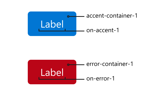
- Container: The fill color for elements that contain text or icons.
- On: Indicates the color of text or icons that is paired with a container color. All surface, accent, and feedback colors have a pairing and should be used together. For example, on-accent should always be paired with an accent-container value.
- Feedback: A group of colors that indicate CRUD (CREATE, READ, UPDATE and DELETE) actions such as success, error, warning, info, and disabled feedback states.
- Accessible System Colors: A set of accessible colors that are used throughout the user interface. These styling hooks contain the complete set of values based on their semantics, brand, neutral, and feedback colors. These styling hooks are mutable and their values are subject to change. Only use in edge cases where a semantic UI color does not make sense.
- Accessible Color Palettes: A range of accessible color palettes. These colors hold no semantics and can be used within the user interface. These values are immutable and will not change.
- Ranges: Every global styling hook set uses names that end in a numerical range, starting at 1 and ending at x. The lowest number is always the lightest color of a color range or lowest value of property range. The highest number x is the darkest color of a color range or largest value of a property range.
Understand the SLDS color system
The SLDS color system provides a flexible framework that makes it easier to implement consistent and aesthetically pleasing designs across your products. It consists of derived color values for primary key colors and UI "surfaces", as well as explicit color values. Here we explain how to effectively use this color system.
Surface Colors
A surface can be defined as the canvas in which UI elements sit. Surface colors express the visual stacking context of our application. Surface colors work in harmony so that making sweeping changes like dark mode can be enabled with ease.
Surfaces
--slds-g-color-surface-1--slds-g-color-surface-2Usage
Surface colors are reserved for the bottom layer of a surface. These elements are surfaces:
- application background
- panels
- modals
- docked containers
- popovers
Anything that comes into the application's view and has a higher stacking context than a previous surface ultimately establishes a new surface.
Surface Containers
--slds-g-color-surface-container-1--slds-g-color-surface-container-2--slds-g-color-surface-container-3Usage
Surface container colors are reserved for the elements that sit on top of a surface, and contain other UI elements or artifacts, such as text or icons. These elements are surface containers:
- cards or containers
- buttons
- button icons
- tabset
One of the clearest signals that something is a surface container is if there is text or icons residing on it.
WCAG 2.1 color contrast requirements
To ensure proper WCAG 2.1 color contrast requirements, pair the text that sits on top of a surface with an
onsurface value. It is valid to use any of the accent or feedback colors that are used for text or icons on top of a surface color, for example,--slds-g-color-accent-1
On Surface
--slds-g-color-on-surface-1--slds-g-color-on-surface-2--slds-g-color-on-surface-3Usage
On-surface colors are reserved for text or icons that sit on top of a surface or surface container. Use the on-surface color value as this ensures you pass correct color contrast that meets WCAG 2.1 requirements.
For example, if a surface container uses--slds-g-color-surface-container-3, the text on it should use--slds-g-color-on-surface-3.
Border Colors
--slds-g-color-border-1--slds-g-color-border-2Usage
The border colors are reserved for borders or outlines that need to render the neutral color. These are our “grey” border colors. Use only on the following properties:
- border-color
- outline
- stroke
WCAG 2.1 color contrast requirements
For compliance with WCAG 2.1 color contrast guidelines, if your component is an interactive element like a
buttonorinput, use--slds-g-color-border-2. If your component is a non-interactive, presentational element like a divider line, use--slds-g-color-border-1.
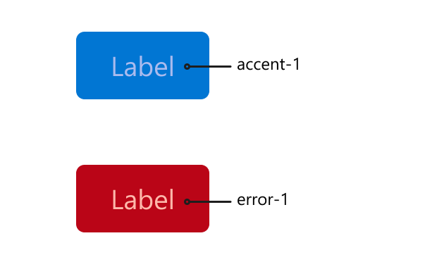
Accent Colors
Accent colors express a brand's accent color throughout the user interface or to draw attention to an action.
--slds-g-color-accent-1--slds-g-color-accent-2--slds-g-color-accent-3Usage
Accents can be used when there is no text or icon sitting on top of the accent color. Typically accents are used to draw attention to something, and is used as a text color or to denote that an element is active or selected. These elements can use accent colors:
- links
- icons
If elements that use accent colors aren't sitting on top of another accent color, pair them with a surface color. For example, pair a link that's using
--slds-g-color-accent-1with a surface that's using--slds-g-color-surface-container-1.
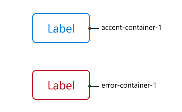
Accent Containers
--slds-g-color-accent-container-1--slds-g-color-accent-container-2--slds-g-color-accent-container-3Usage
Accent containers are similar to surface containers, except that text or icons reside on top of the brand accent. These elements are accent containers:
- brand buttons
- selected/active states
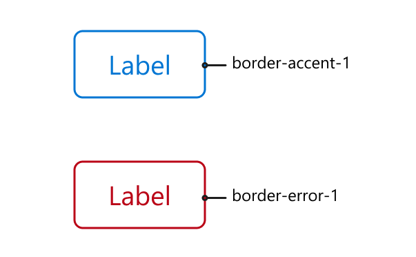
Border Accent
--slds-g-color-border-accent-1--slds-g-color-border-accent-2--slds-g-color-border-accent-3Usage
The border accent color is reserved for adding borders or outlines that render the brands accent color. You can use this independently or pair it with an accent container color.
Feedback Colors
Feedback colors are a way to express stateful feedback messaging based on a response or interaction type. We have feedback colors for the following message types:
- error
- success
- warning
- informational
- disabled
Each feedback type comes with a generic color to use for text and icons, container colors, on color, and border color values.
Error Colors
Error colors are reserved for component states that indicate that an error has occurred or could occur if action is taken.
--slds-g-color-error-1--slds-g-color-error-container-1--slds-g-color-error-container-2--slds-g-color-on-error-1--slds-g-color-border-error-1--slds-g-color-border-error-2Success Colors
Success colors are reserved for component states that indicate that a successful action has occurred or will occur if action is taken.
--slds-g-color-success-1--slds-g-color-success-container-1--slds-g-color-success-container-2--slds-g-color-on-success-1--slds-g-color-on-success-2--slds-g-color-border-success-1Warning Colors
Warning colors are reserved for component states that indicate that something has prevented an action from being taken, such as a dirty state of a form.
--slds-g-color-warning-1--slds-g-color-warning-container-1--slds-g-color-on-warning-1--slds-g-color-border-warning-1Informational Colors
Informational colors are reserved to provide visual feedback to indicate that some content on the page is purely informational.
--slds-g-color-info-1--slds-g-color-info-container-1--slds-g-color-on-info-1Disabled Colors
Disabled colors are reserved for component states to indicate that the component is disabled and you can't interact with it.
--slds-g-color-disabled-1--slds-g-color-disabled-2--slds-g-color-disabled-container-1--slds-g-color-disabled-container-2--slds-g-color-on-disabled-1--slds-g-color-on-disabled-2--slds-g-color-border-disabled-1--slds-g-color-border-disabled-2Usage Guidelines
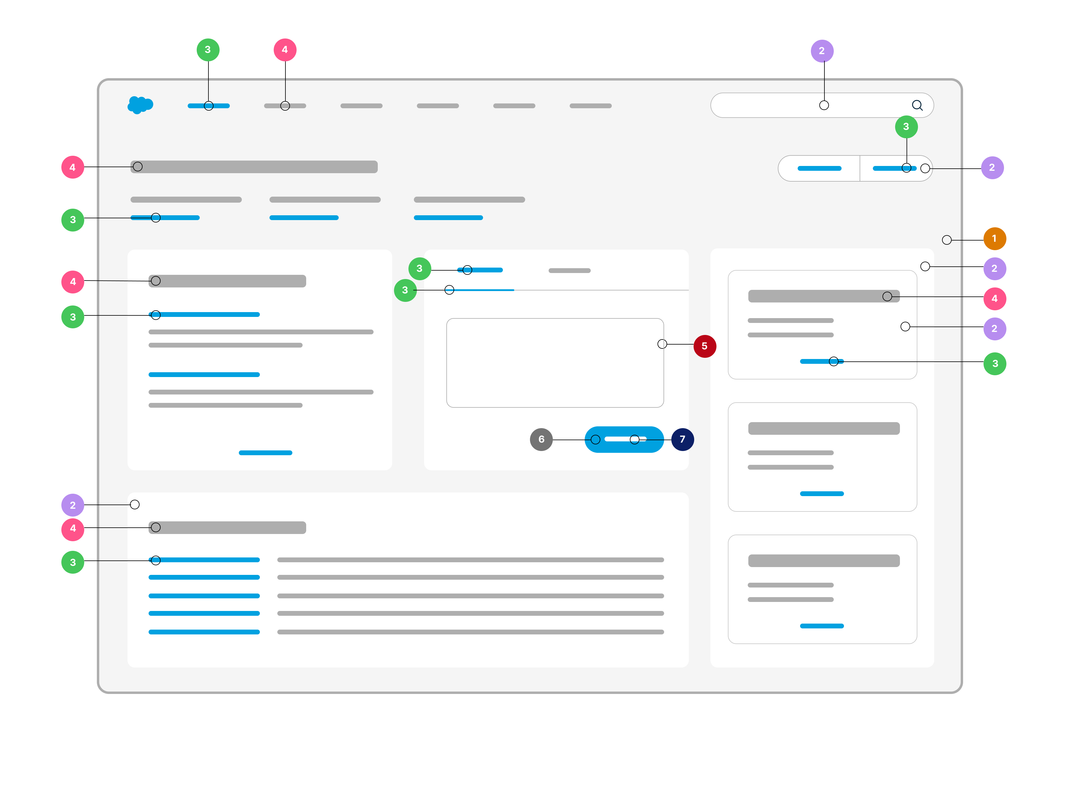
Legend
--slds-g-color-surface-2--slds-g-color-surface-container-1--slds-g-color-accent-1--slds-g-color-on-surface-3--slds-g-color-border-1--slds-g-color-accent-container-1--slds-g-color-on-accent-1
✅ Do
Always use an on color with a container color to ensure WCAG 2.1 color contrast requirements.
❌ Don't
Do not use system colors or colors from another group like surfacecolors in combination with accent containers.
✅ Do
Feel free to use accent/feedback colors to express your brand's accent or intent on top of surface and surface container colors only.
❌ Don't
Do not use accent/feedback colors if text or icons sit on top of the accent color. To ensure correct WCAG 2.1 color contrast, use accent/feedback container color for this scenario.
✅ Do
Always use the appropriate border color for borders or outlines, if necessary.
❌ Don't
Do not use non-border accent colors on borders to achieve a border with an accent color.
Accessible System Colors
A set of accessible colors that are used throughout the user interface. These stying hooks contain the complete set of values based on their semantics, brand, neutral, and feedback colors. These are mutable and their values are subject to change. Only use in edge cases where a semantic UI color does not make sense.
These styling hooks are also documented in the Global Color Style Hooks for accessibility.
Neutral Colors
Brand Colors
Error Colors
Warning Colors
Success Colors
Accessible Color Palettes
These styling hooks are also documented in the Global Color Style Hooks for accessibility.
Shadows
These properties control the appearance of shadows, affecting the depth perception and layering of UI elements.
Border Radius
These properties manage the curvature of UI elements' corners, impacting the perceived softness or hardness of components.
Typography
These properties influence the typography in your application, defining aspects like font family, size, weight, line-height, etc.
Font Scale
Font sizes are scaled, based on the --slds-g-font-size-base property which sets the default font-size of the application.
Font Weight
Font weights are available in a range where --slds-g-font-weight-4 is normal weight.
Line Height
Line height values are set to unitless numbers which are multiplied by the font size used in the element to obtain the desired line height.
Lorem ipsum dolor sit amet consectetur adipisicing elit. Unde harum officiis sit at mollitia, ducimus natus doloremque quos maiores obcaecati consequuntur pariatur quisquam nobis sequi excepturi in dolorem provident iste!
Lorem ipsum dolor sit amet consectetur adipisicing elit. Unde harum officiis sit at mollitia, ducimus natus doloremque quos maiores obcaecati consequuntur pariatur quisquam nobis sequi excepturi in dolorem provident iste!
Lorem ipsum dolor sit amet consectetur adipisicing elit. Unde harum officiis sit at mollitia, ducimus natus doloremque quos maiores obcaecati consequuntur pariatur quisquam nobis sequi excepturi in dolorem provident iste!
Lorem ipsum dolor sit amet consectetur adipisicing elit. Unde harum officiis sit at mollitia, ducimus natus doloremque quos maiores obcaecati consequuntur pariatur quisquam nobis sequi excepturi in dolorem provident iste!
Lorem ipsum dolor sit amet consectetur adipisicing elit. Unde harum officiis sit at mollitia, ducimus natus doloremque quos maiores obcaecati consequuntur pariatur quisquam nobis sequi excepturi in dolorem provident iste!
Spacing
The spacing values are used to create space between elements. The styling hook values are relative to the root font size and follow a modular scale of 4. Use them to set values for margins and padding, for example.
Don't use spacing properties to establish dimensions of an element targeting width and height. Use the sizing properties for this purpose.
Sizing
The sizing values are used to create dimensions of an element, like using height and width based properties.
Border Widths
Use these styling hooks to specify the pixel width of a border.
Dimensions
Use these styling hooks for elements like icons to set their height and width relative to the root element's font-size.
Salesforce Private CSS Properties and Syntax
The use of SLDS private styling hooks and
@layersyntax is prohibited.
Some SLDS styling hooks are private and reserved only for internal Salesforce use. They aren't documented for your use. Private SLDS styling hooks have prefixes --_slds- and --slds-s-. If you come across one of these hooks in your rendered content, don't use it as a reference or assign a new value to it. These reserved properties are subject to change and can be removed in future releases.
You may also discover some syntax called @layer. This is an internal mechanism Salesforce uses to establish the correct CSS cascade that we expect CSS to render. Don't attempt to use @layer within your component CSS or modify the CSS within a layer.
See Also
For the complete list of global styling hooks, see the Global Styling Hooks Reference.